Or how it only takes four days of Autumn cooling to undo five days of Spring warming.
weather
Published
January 31, 2025
Like so many Brits, I’m obsessed with the weather. I ask questions like, “When is spring coming?” and “How long is summer?”
Annoyingly, though, I never had reasonable answers for these sorts of questions. And, for that reason, I thought I’d consult the data to get better answers.
I turns out that this data-driven approach helps, as I now have better working definitions of the seasons and can judge my expectations accordingly.
Before we get to those conclusions, I take two steps with the data.
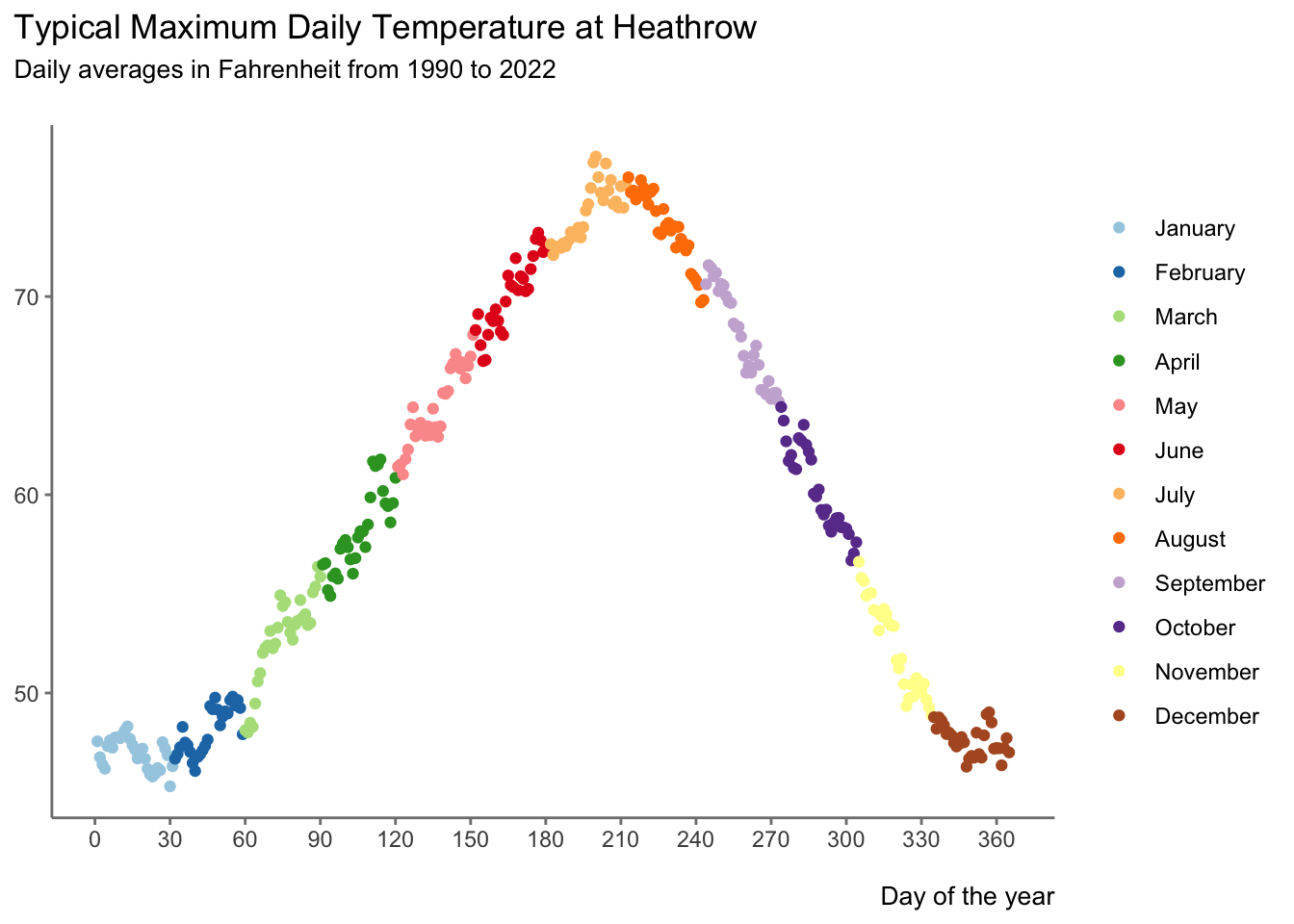
First, I get it and clean it. Specifically, for each day of the year, I collect the maximum temperature achieved at Heathrow in each year from 1990 to 2022. I then average these 33 data points to get one value for the typical maximum temperature on that day at Heathrow.
Second, I’ll chart how this average maximum temperature varies by the day of the year.
</>
plot_seasons <- data |>ggplot(aes(x = value_daynumber,y = temp_max_ave,colour = name_month ) ) +scale_y_continuous(labels =40+0:3*10, breaks =40+0:3*10, minor_breaks =NULL ) +scale_x_continuous(breaks =30*0:12) +scale_color_brewer(type ="qual", palette =3) +geom_point() +theme_minimal() +theme(plot.title.position ='plot',plot.subtitle =element_text(size =10),axis.title.x =element_text(size =10, hjust =1),legend.title =element_blank(),panel.grid =element_blank(),axis.line =element_line(colour ="grey50"),axis.ticks =element_line(colour ="grey50") ) +labs(title ="Typical Maximum Daily Temperature at Heathrow",subtitle ="Daily averages in Fahrenheit from 1990 to 2022\n",y =NULL,x ="\nDay of the year" ) plot_seasons
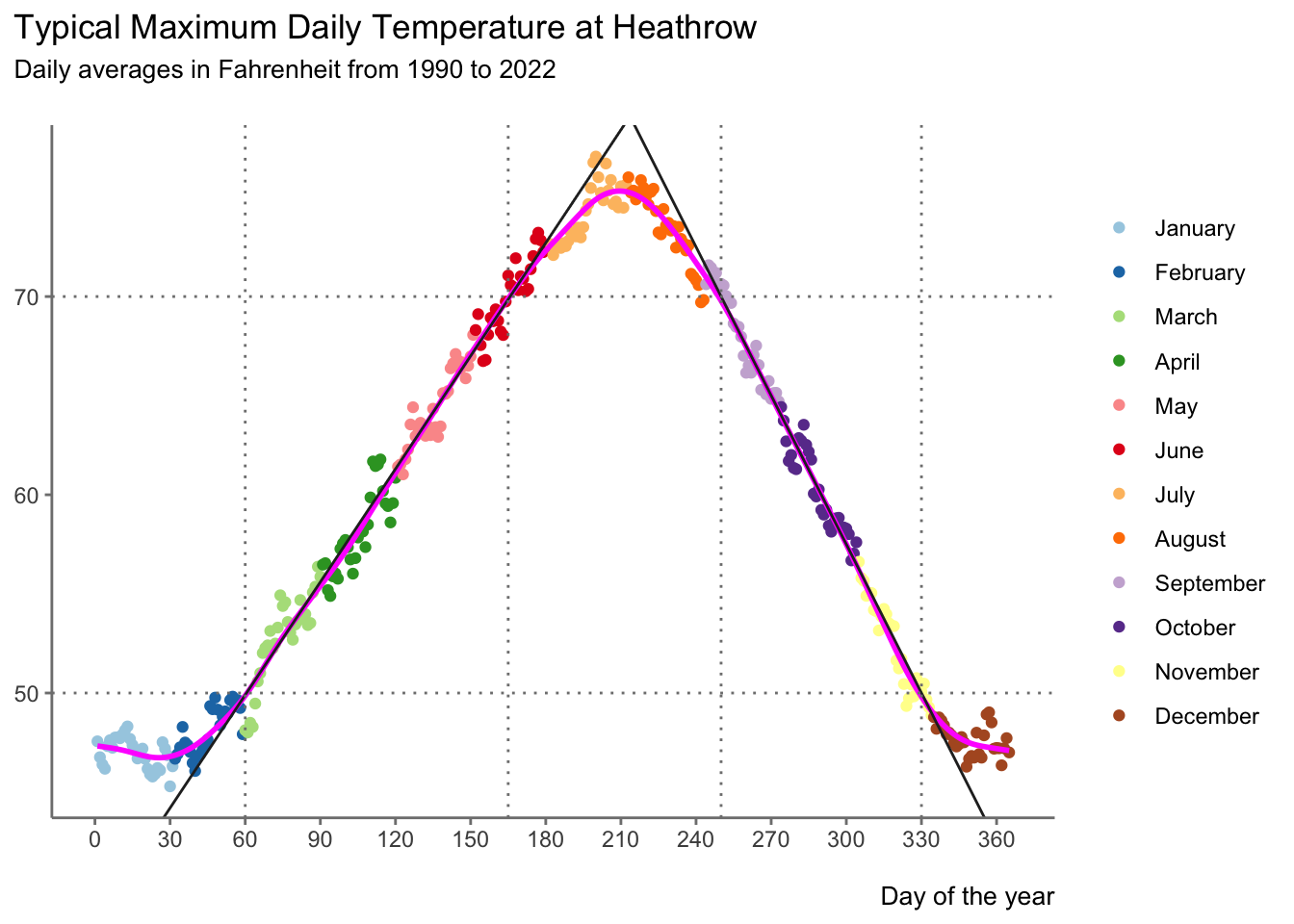
OK, so that chart helps, but it is more useful if we add some context to it.
</>
plot_seasons +geom_spline(aes(x = value_daynumber,y = temp_max_ave ),spar =0.66,colour ='magenta', linewidth =1 ) +geom_abline(slope =0.19, intercept =38.5, color ='grey15') +geom_abline(slope =-0.25, intercept =132.5, color ='grey15') +geom_vline(xintercept =60, color ='grey50', linetype =3) +geom_vline(xintercept =165, color ='grey50', linetype =3) +geom_vline(xintercept =250, color ='grey50', linetype =3) +geom_vline(xintercept =330, color ='grey50', linetype =3) +geom_hline(yintercept =50, color ='grey50', linetype =3) +geom_hline(yintercept =70, color ='grey50', linetype =3)
So, what does this mean?
Based upon the chart above, I will now use the following definitions:
Long Linear Spring warms linearly and is the longest season, running from March until mid June
Short Summer is the shortest season … 🙄 … lasting from mid June until the end of August, when typical daily maximum temperatures exceed 70°F
Linear Autumn cools linearly over September, October and November
Winter consists of December, January and February, when typical daily maximum temperatures fall below 50°F
So, daily maximum temperature change in Spring and Autumn is typically linear. Sadly, though, Autumn cools faster than Spring warms. Specifically, Spring sees maximum temperatures typically rise by 0.19°F per day, whilst the corresponding decline in Autumn is 0.25°F per day. In other words, five days of gains in Spring are needed to counteract four days of losses in Autumn.