library(tidyquant)
library(tidyverse)
library(tsibble)
library(waldo)

# weights_index <- tq_index("DOW")
# write_rds(x = weights_index, file = "weights_index.rds")

# stock_prices  <- tq_get(
#   x = weights_index |> pull(symbol),
#   get = "stock.prices",
#   from = "2022-01-01")
# write_rds(x = stock_prices, file = "stock_prices.rds", compress = "xz")To do so, I’ll deliberately pick a minimal example and assume that our portfolio has the thirty-stock Dow-Jones Industrial Average (DJIA) as its index.
I’ll show the results in a couple of paragraphs. Before that, let’s consider a little of the theory behind this analysis. Specifically, that the active variance of a portfolio relative to its index is: \[\omega^2 = X^T V X\]
, where:
X is a vector of ‘excess weights’ for the thirty stocks (i.e. portfolio weight less index weight)
V is a square matrix of the covariances between the returns of the thirty stocks
Given this equation, I see that I need to begin the analysis by downloading the holdings of the index and the pricing data for the constituent stocks.
Stock holdings
With this data, I can see that the DJIA has the following stocks. For the sake of simplicity, I assume that these thirty stocks are weighted equally in our portfolio.
data_weights <- read_rds("weights_index.rds") |>
  mutate(
    wt_port = 1/30,
    wt_excess = wt_port - weight) |>
  arrange(symbol)

data_weights |>
  select(company, symbol, `excess weight` = wt_excess)
Return covariances
Before I can project the risk in this portfolio, though, I also need to find the covariances between the returns of the stocks in question.1
For the sake of brevity, here are the first four rows and columns of this covariance matrix.
return_covariances <- read_rds(file = "stock_prices.rds") |>
  as_tsibble(index = date, key = symbol) |>
  mutate(yyyymm = tsibble::yearmonth(date)) |>
  slice_max(order_by = date, by = yyyymm) |>
  as_tsibble(index = date, key = symbol) |>
  mutate(return = (adjusted/lag(adjusted)) - 1) |>
  pivot_wider(id_cols = date, names_from = symbol, values_from = return) |>
  column_to_rownames(var = "date") |>
  cov(use = "pairwise.complete.obs")

as_tibble(return_covariances[1:4, 1:4])
Projecting risk
We now have the two ingredients that we need for risk analysis: excess weights and covariances of stock returns. As a final test, let’s confirm that the order of the tickers in our vector matches that for our matrix.
compare(
  pull(data_weights, symbol),
  colnames(return_covariances)
  )
✔ No differencesWith that confirmed, I can use the formula above to project the active variance of the portfolio.
(
  variance_active_monthly <- t(data_weights$wt_excess) %*% return_covariances %*% data_weights$wt_excess
  )
[,1]
[1,] 0.01163479Because I am considering covariances with a monthly periodicity, it will help to annualise the result, so that it can be compared with corresponding values from other portfolios. To do so, I multiply the active variance by 12.2 Finally, I square-root the result to obtain \(\omega\), the annualised level of projected active risk:
(
  risk_active_annual <- as.numeric(
    sqrt(variance_active_monthly * 12)
    )
  )
[1] 0.3736543This annualised ‘tracking-error’ of 37.4% is very high for a US equity portfolio, but is not surprising given my arbitrary choices around the portfolio and index.
Decomposing risk
The question then becomes: “What portfolio positions contribute most to this active risk?”
To answer this question, we can tweak the equation above. Calculating \(X^T V\) generates a vector of length thirty, with each element showing a form of ‘unit marginal impact’ on active portfolio variance for a given stock. If we then multiply this value for a given stock by its excess weight, we obtain its contribution to monthly active portfolio variance.3
variance_active_monthly_cont <- return_covariances %*% data_weights$wt_excess |>
  as.data.frame() |>
  rownames_to_column(var = "symbol") |>
  inner_join(data_weights, by = "symbol") |>
  mutate(AV_cont = wt_excess * V1) |>
  select(symbol, company, sector, wt_excess, AV_cont)

variance_active_monthly_cont |>
  select(symbol, sector, `AV contribution` = AV_cont)
To decompose this active variance by sector, we group stocks by sector and sum their stock-level contributions.
variance_active_monthly_cont |>
  summarise(AV_total = sum(AV_cont), .by = sector) |>
  mutate(
    sector = as_factor(sector),
    sector = fct_reorder(sector, AV_total)) |>
  ggplot(
    aes(
      x = AV_total,
      y = sector,
      fill = AV_total < 0)) +
  labs(
    title = "Contribution to active variance by sector\n",
    x = NULL,
    y = NULL) +
  geom_col() +
  theme_minimal() +
  theme(
    plot.title.position = "plot",
    legend.position = "none")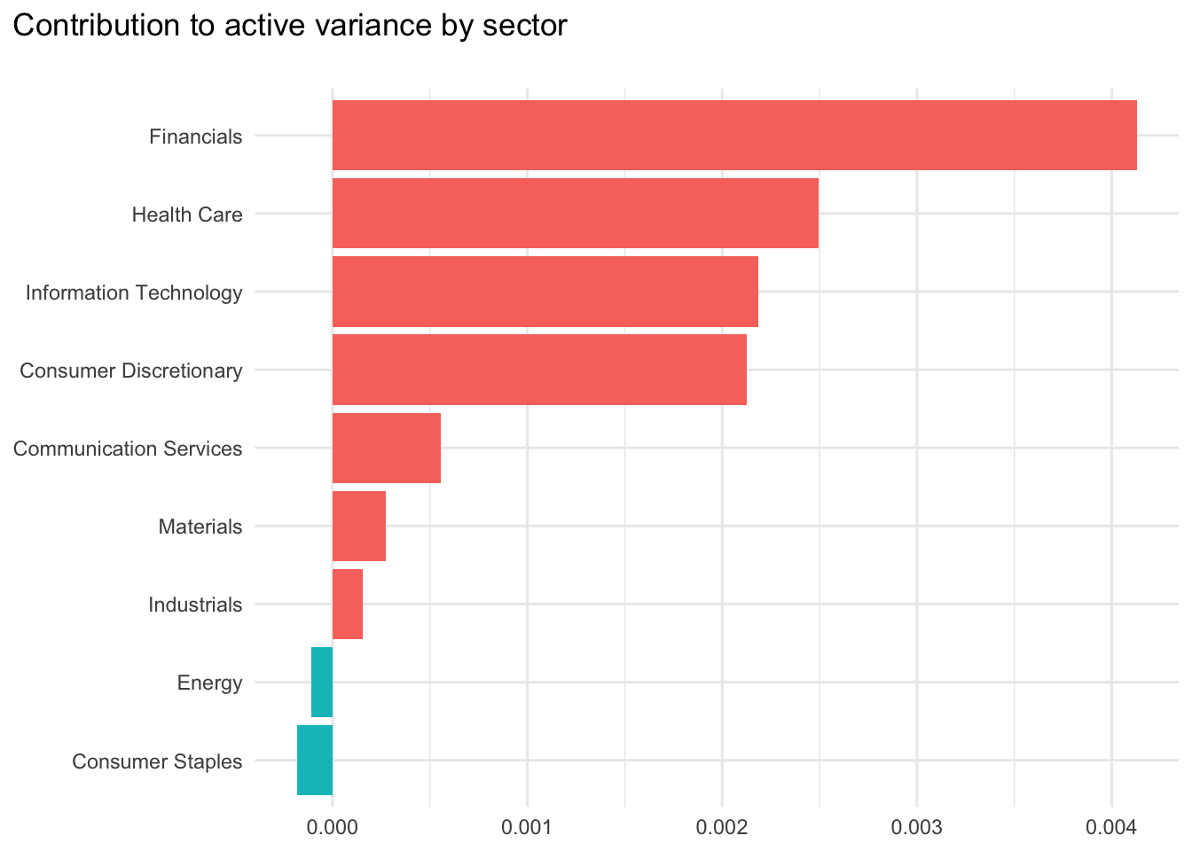
Conclusions
So, what does this analysis tell us? To me, there are two main points:
The portfolio’s tracking error is very high, although that is an artefact of the simplified nature of my example
Financials stocks are a key contributor to this active variance. This sector has high weights in the index but lower weights in the portfolio. However, the portfolio’s positions in Energy and Consumer Staples stocks generates a diversification benefit that reduces overall portfolio risk.
Although these results might be useful, it is worth recognising that I have limited this risk analysis to only a standard covariance matrix, decomposed by sector. In reality, the returns data and covariance matrix could be more nuanced and decomposition could extend beyond sectors. For example, we could decompose risk by ESG scores, diversity criteria, valuation ratios or anything else that seems relevant and that can be measured.
Footnotes
For the sake of simplicity, I only consider split-adjusted price returns rather than the equivalent total returns in this example↩︎
This might be a heroic assumption, as it implies an independence between the risks experienced in different months↩︎
Note that the sum of these values will add to the total active variance, as this calculation is essentially vector multiplication.↩︎